On the traces of Forte
In the late 1990s, the font found its way into the Windows operating system – and thus onto millions of desktop computers worldwide.
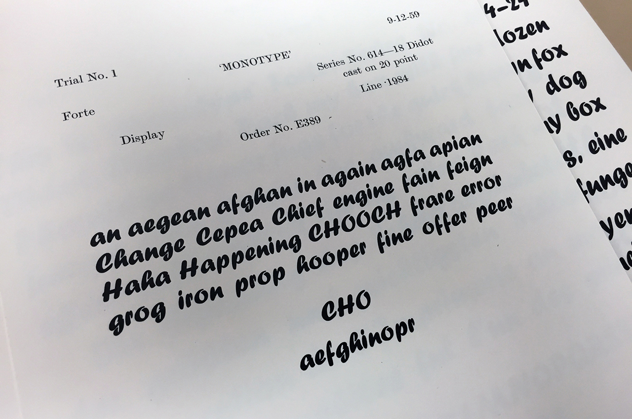
Karl Reissberger's legacy contains extensive correspondence with Monotype (he was associated with the company throughout his life as a consultant for typesetting machines), the only thing missing until now was a license agreement. But we found documents for a mysterious “Font Nr 2”.
With his daughter Mara Reissberger I flew to London on the tracks of the Forte. Toshi Omagari, senior type designer at Monotype, opened the archive for us.
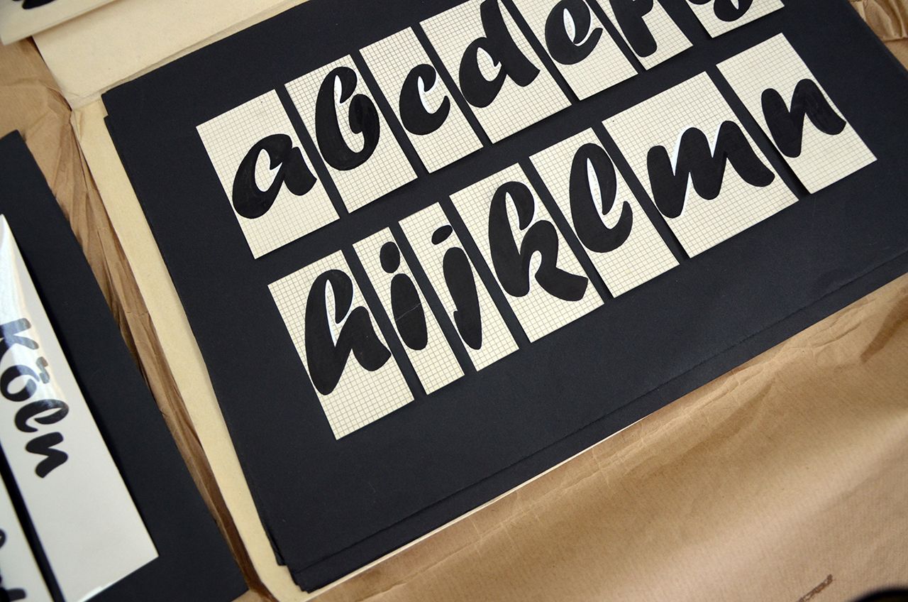
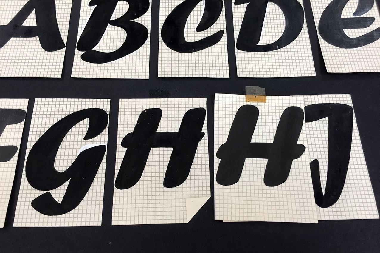
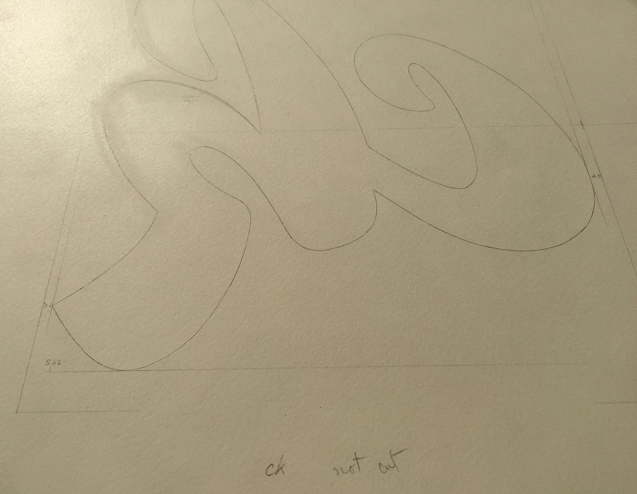
Not approved drafts were clearly marked by dog-ears.
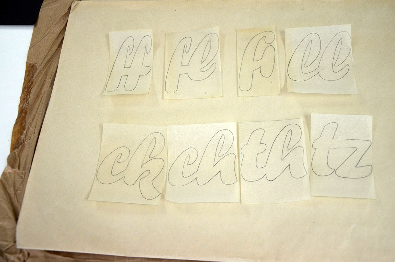
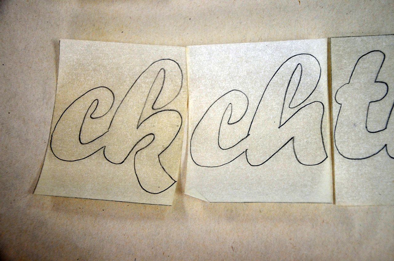
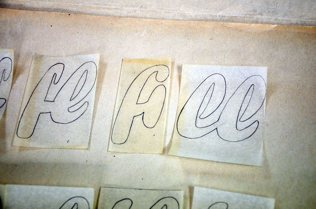
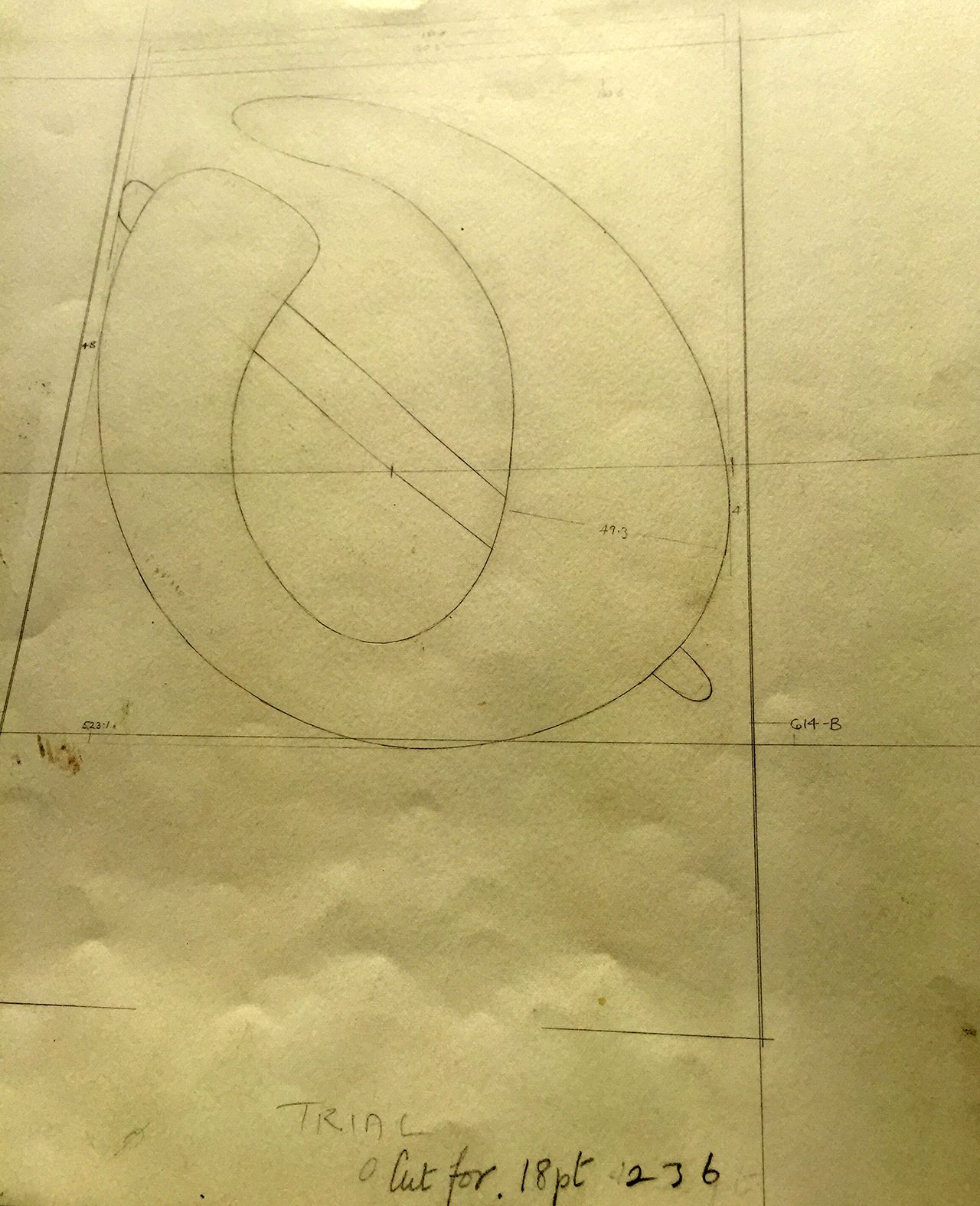
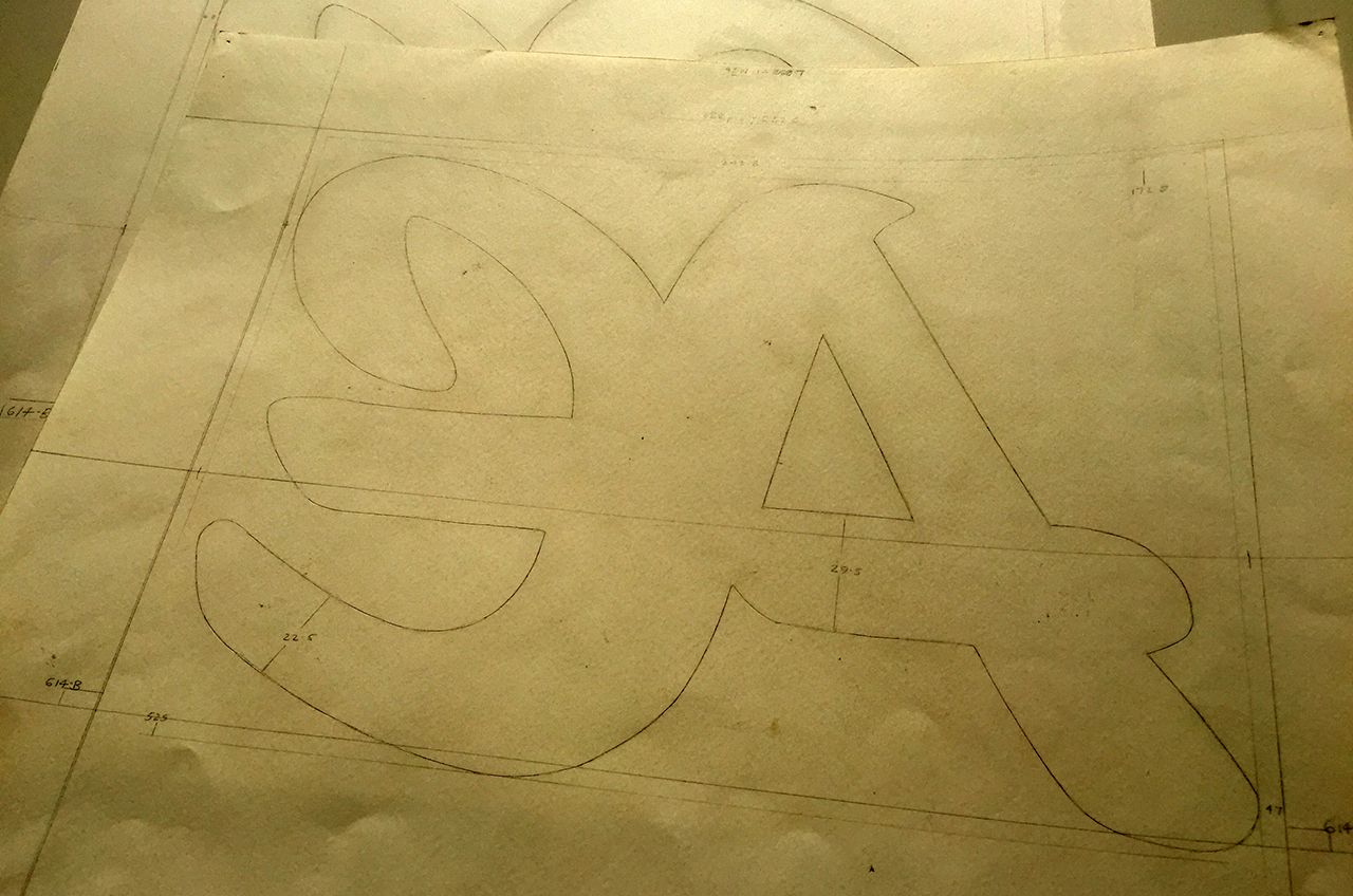
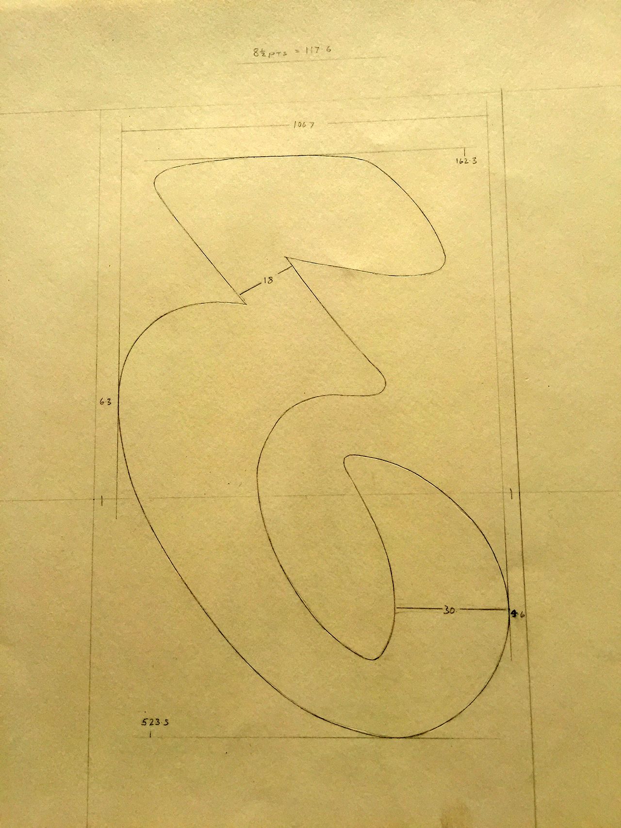
Different styles for reproduction in cast or film.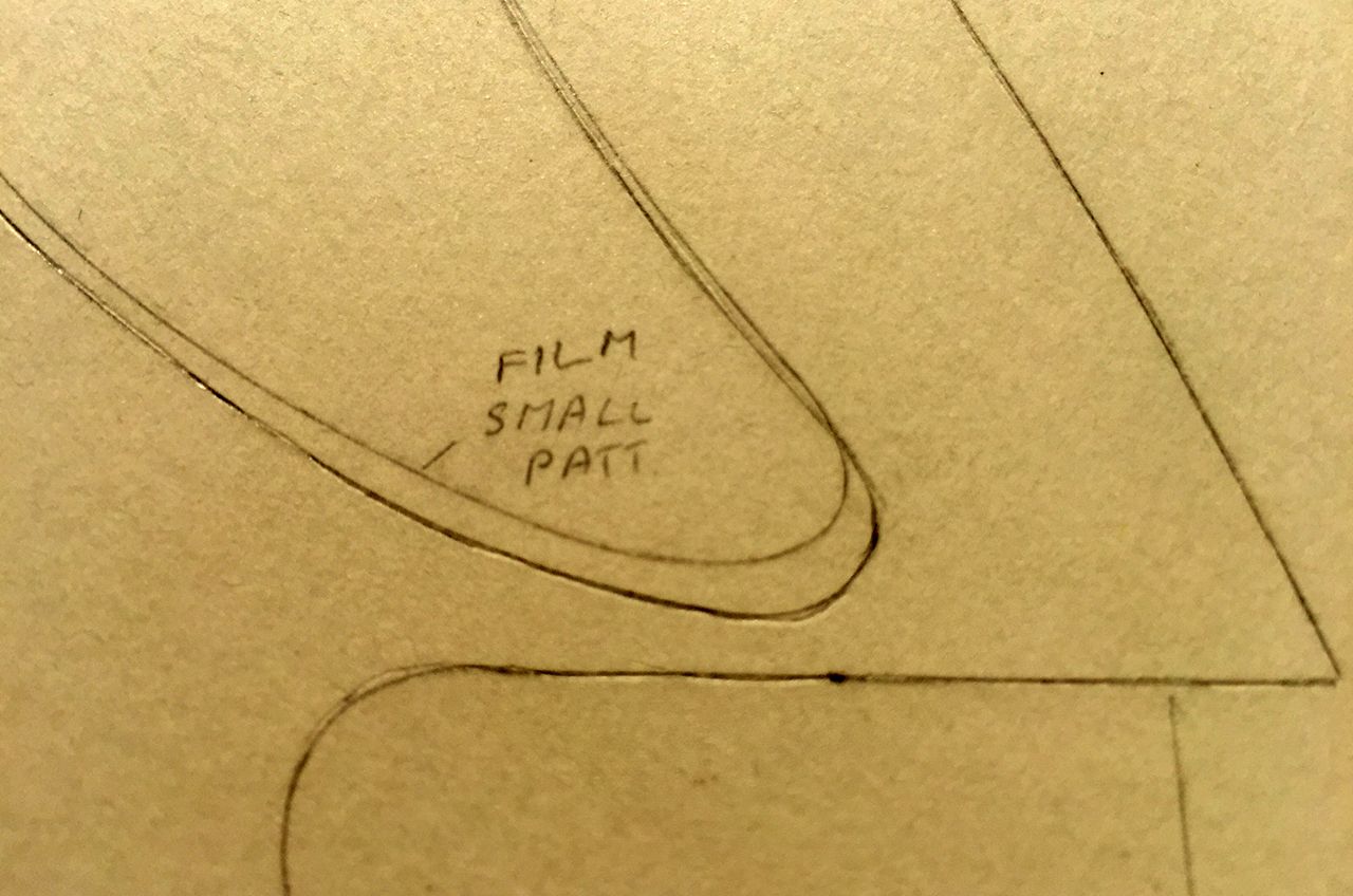
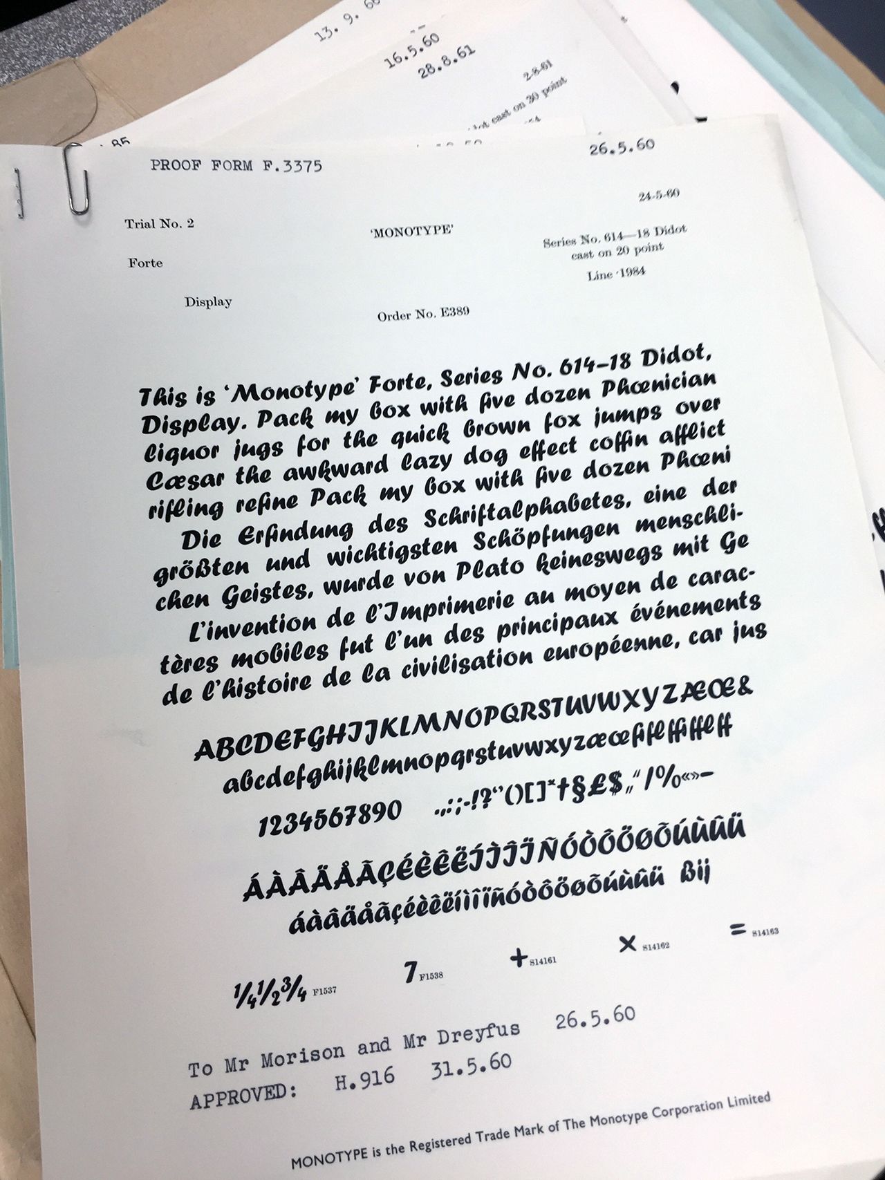
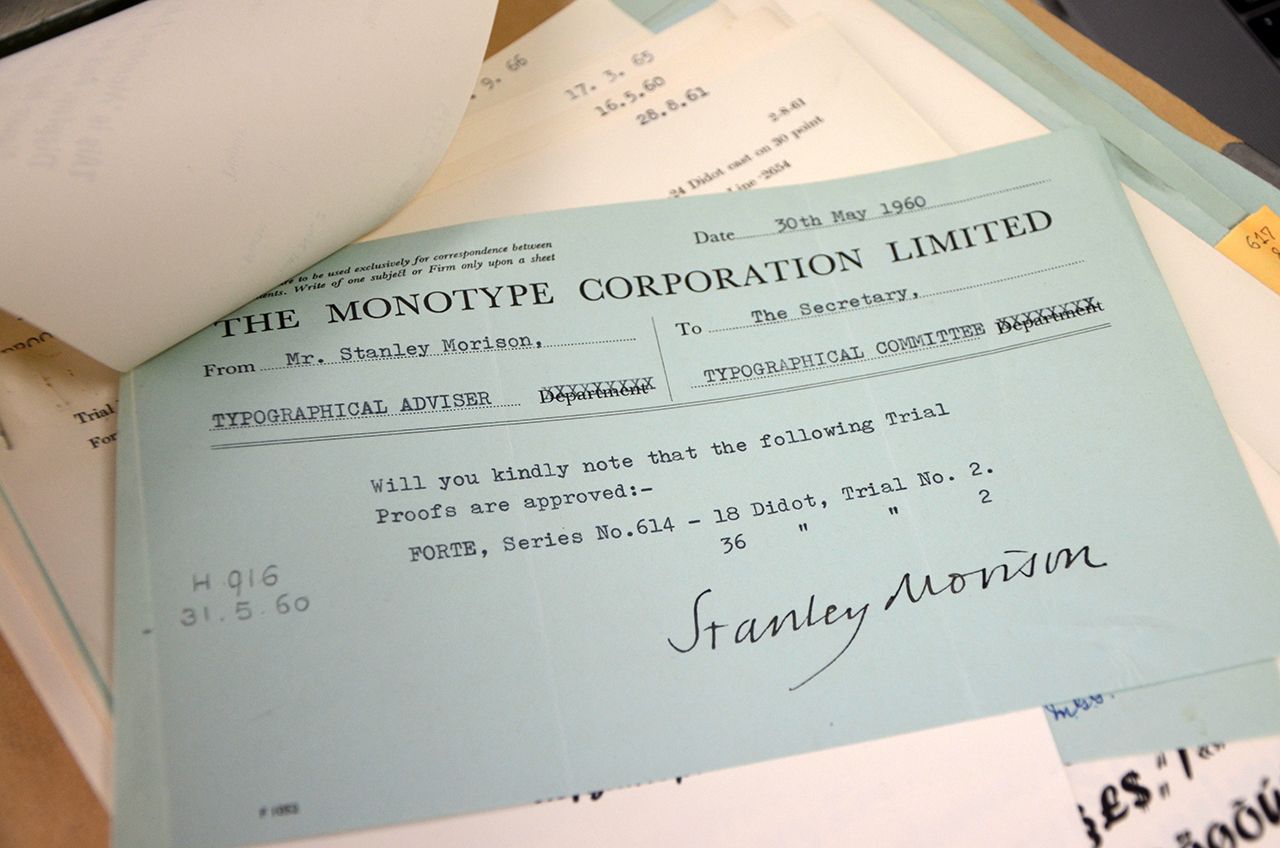
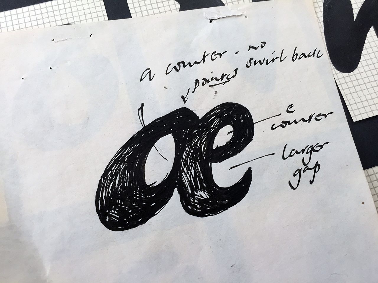
Mara Reissberger and Toshi Omagari, who is currently working on fortissimo, a remake of Forte.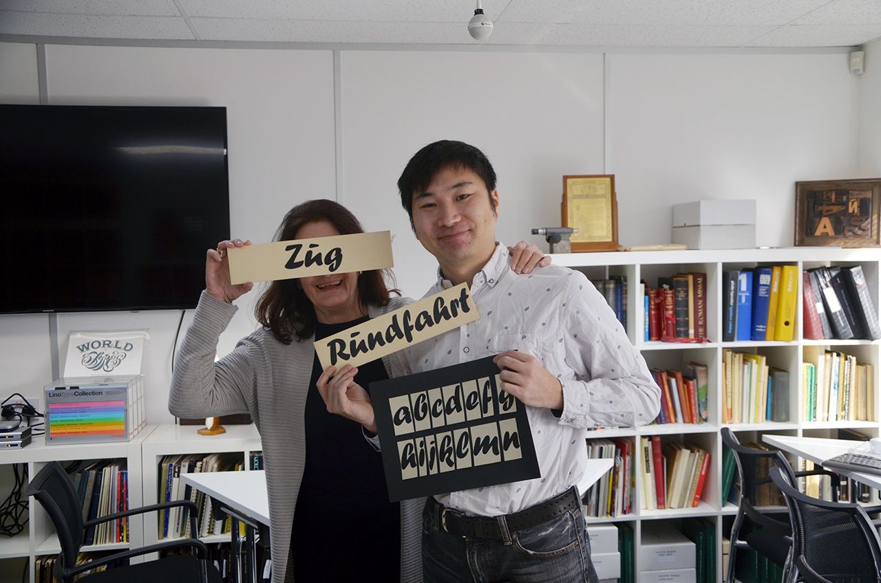
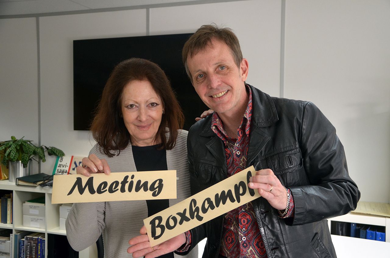
Conclusion
Forte was designed in 1962 by the Austrian commercial artist Carl Reissberger who was trained as a compositor and later taught typography and drawing in Vienna. The idea for the Forte script font came from the study of plants, individual letter forms being inspired by the long stems and furry heads of the reed. This description of the Forte and its originator is commonly found.
As far as I know, it would have to be rewritten, because Prof. Karl Reissberger not only always spelled himself with a “K”, he also designed the font before 1956. In the years that followed, the approval process was underway and Forte was probably licensed to business customers by Monotype even before its release in 1962. This is indicated by the subsequently ordered extensions.
It is quite possible, however, that he was really inspired by organic leaf shapes for the Forte. Themes from nature can be found in his entire artistic work.


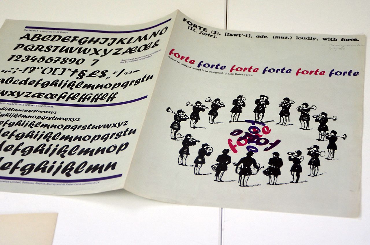
Font specimen / brochure 1964
Use in the 1960s to 1980s
After its publication, the forte was widely used, especially in the German-speaking world: Newspaper titles, film posters and advertisements were the preferred areas of application. As it was only published in one cut, it was used almost exclusively in headlines and as a display font. The Forte is also often seen in early Hofer (Aldi) brochures. Karl Reissberger's wife collected the finds.


Taking off on desktops worldwide
The release of Office 97 in November 1996 was considered a milestone in software development. The bundle was distributed on CD-ROM or on a total of 44 3½-inch floppy disks and for the first time contained a knobbly font from Vienna: the Forte!
Microsoft Corporation had its own “Typography Group” in the 1990s. Its task was to develop fonts and to optimize purchased typefaces for the operating system. When it came to external fonts, they worked with Monotype as a partner. According to Tom Stephens, former program manager at Microsoft and thus also responsible for the font selection, the choice of Forte for her debut at Publisher '97 involved Vincent Connare, designer of the Comic Sans, in addition to Robert Norton and Andrew Pennock.
From then on, the Forte was included in every Office package for nearly 20 years (until Office 2010, support for which ended in 2015), giving it incredible worldwide distribution. It is still part of the Office Cloud Fonts today.
In terms of distribution, Forte is probably the most successful Austrian font. This can also be seen in the worldwide examples of its use.


